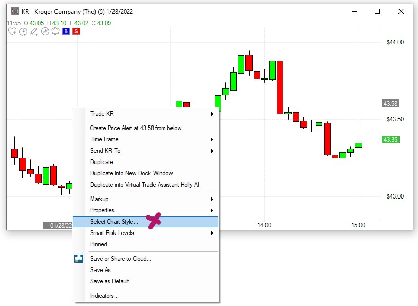
Select Chart Style
To change the type and style of your chart including its color scheme, right-click into the chart and choose Select Chart Style.
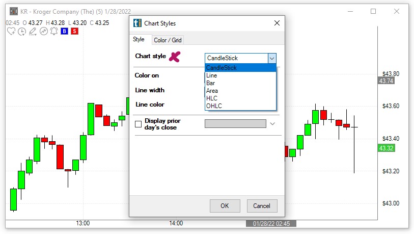
Styles Tab
The Chart style dropdown enables you to choose between Candlestick Charts, Line Charts, Bar Charts, Area Charts, HLC Charts or OHLC Charts.
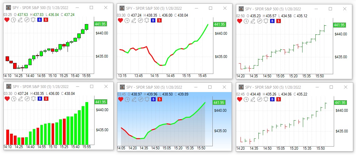
The Color on dropdown enables you to display the chart in two colors based on Open vs Close or in one color.
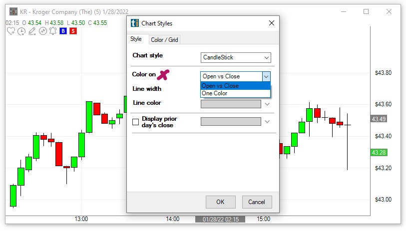
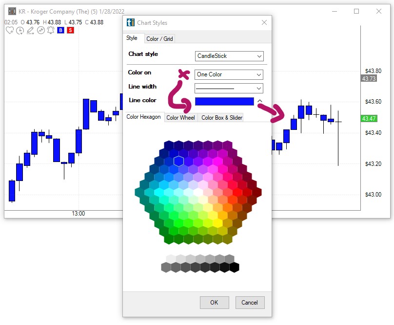
When selecting One Color, head to the Line Color dropdown to make your color choice:
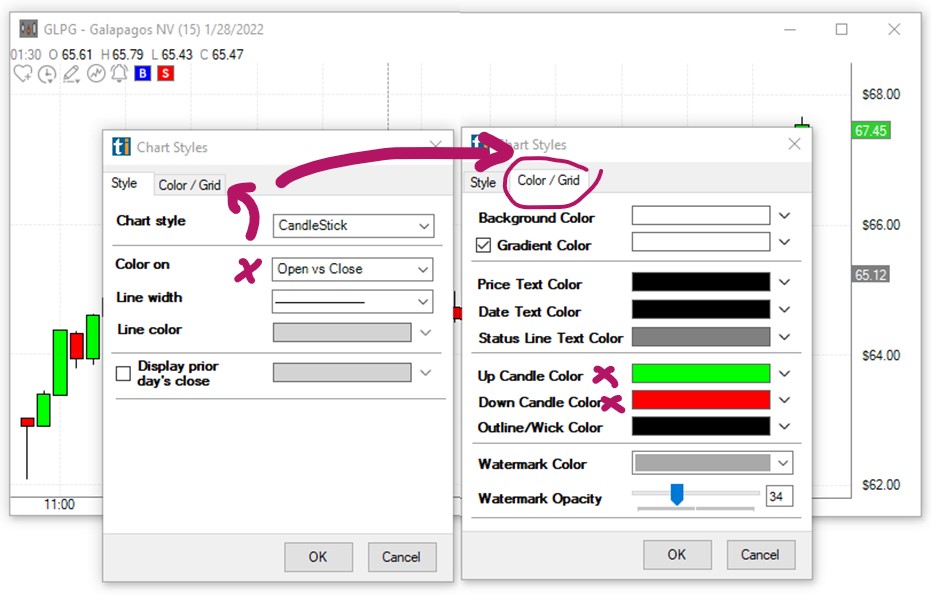
When selecting Open vs Close, open the Color/Grid Tab, then choose an Up Candle Color and a Down Candle Color from the respective dropdowns:
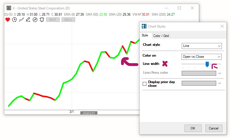
The Line width slider enables you to select the line thickness of your Line, Area, HLC and OHLC Charts:
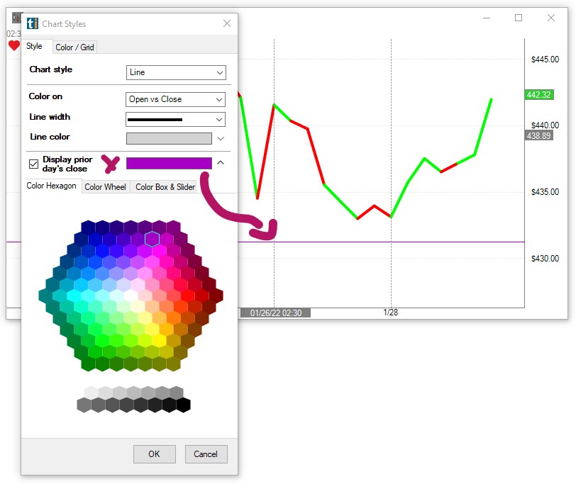
When the option Display prior day's close is checked, a horizontal line indicating yesterday's closing price will be added to your chart. Use the Color Hexagon, the Color Wheel or the Color Box & Slider to choose a color for the closing price line:
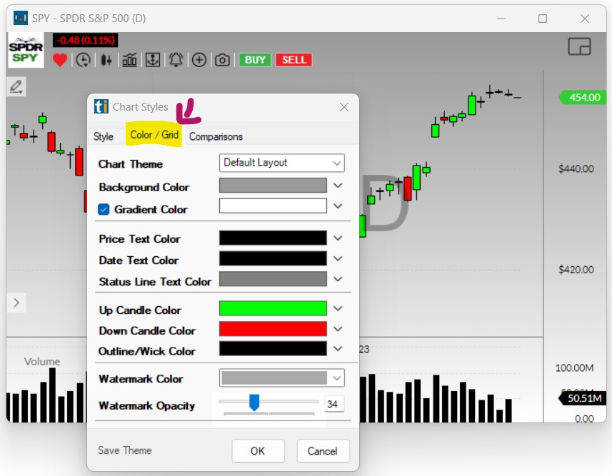
Color/Grid
To change the background color, candle color as well as text color of your chart, right-click into the chart, choose Select Chart Style, then open the Color/Grid Tab.
- Chart Theme
The Chart Theme dropdown contains a few ready-made chart styles to choose from.
- Background Color
To select a Background Color, click the downward pointing arrow to open the color selection menu. Here, you can choose a color from the Color Hexagon, the Color Wheel, or the Color Box & Slider. You will see the color changes displayed on your chart as you toggle through the different color options.
Once you have selected a color, click OK to apply the changes and close the Chart Style Menu or click the upward pointing arrow to continue the color selection for your chart.
- Gradient Color
To apply a Gradient Color, check the box on the left-hand side of the Gradient Color option, then click the downward pointing arrow to open the color selection menu. Here, you can choose a gradient color from the Color Hexagon, the Color Wheel or the Color Box & Slider. You will see the color changes displayed on your chart as you toggle through the different color options.
Click OK to apply the changes and close the Chart Style Menu or click the upward pointing arrow to continue the color selection for your chart.
- Price Axis
To apply a different color to the Price Axis, click the downward pointing arrow to open the color selection menu. Here, you can choose a Price Text Color from the Color Hexagon, the Color Wheel or the Color Box & Slider. You will see the color changes displayed on your chart as you toggle through the different color options.
Click OK to apply the changes and close the Chart Style Menu or click the upward pointing arrow to continue the color selection for your chart.
- Date Axis
To apply a different color to the Date Axis, click the downward pointing arrow to open the color selection menu. Here, you can choose a Date Text Color from the Color Hexagon, the Color Wheel or the Color Box & Slider. You will see the color changes displayed on your chart as you toggle through the different color options.
Click OK to apply the changes and close the Chart Style Menu or click the upward pointing arrow to continue the color selection for your chart.
- Status Line Color
To apply a different color to the Status Line Text, click the downward pointing arrow to open the color selection menu. Here, you can choose a Status Line Text Color from the Color Hexagon, the Color Wheel, or the Color Box & Slider. You will see the color changes displayed on your chart as you toggle through the different color options.
Click OK to apply the changes and close the Chart Style Menu or click the upward pointing arrow to continue the color selection for your chart.
- Up Candles Color
To apply a different color to your, by default green, Up Candles, click the downward pointing arrow to open the color selection menu. Here, you can choose an Up Candle Color from the Color Hexagon, the Color Wheel or the Color Box & Slider. You will see the color changes displayed on your chart as you toggle through the different color options.
Click OK to apply the changes and close the Chart Style Menu or click the upward pointing arrow to continue the color selection for your chart.
- Down Candles Color
To apply a different color to your, by default red, Down Candles, click the downward pointing arrow to open the color selection menu. Here, you can choose a Down Candle Color from the Color Hexagon, the Color Wheel or the Color Box & Slider. You will see the color changes displayed on your chart as you toggle through the different color options.
Click OK to apply the changes and close the Chart Style Menu or click the upward pointing arrow to continue the color selection for your chart.
- Wick and Outline Color
To apply a different color to the Candle Wick and Outline, click the downward pointing arrow to open the color selection menu. Here, you can choose a Wick and Outline Candle Color from the Color Hexagon, the Color Wheel or the Color Box & Slider. You will see the color changes displayed on your chart as you toggle through the different color options.
Click OK to apply the changes and close the Chart Style Menu or click the upward pointing arrow to continue the color selection for your chart.
- Watermark Color and Transparency
To change the display of the chart’s watermark, click the downward pointing arrow. Then, make a choice between Off White, which is best when using a darker background color, and Dark Grey, as the base color.
The Watermark Opacity slider enables you to define the watermark’s transparency.
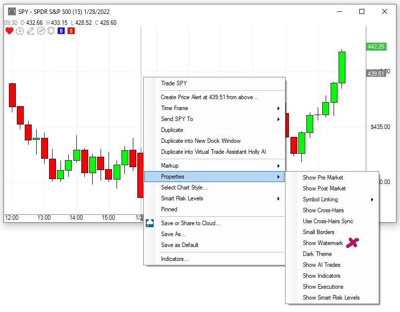
For the Watermark to display, the Show Watermark option needs to be enabled. To do so, right-click into the chart, select Properties and then Show Watermark.
Click OK to apply the changes and close the Chart Style Menu or click the upward pointing arrow to continue the color selection for your chart.
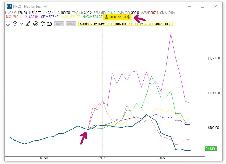
Comparisons Tab
To compare up to 6 stocks on a chart, right-click into a chart, choose Select Chart Style, then open the Comparisons Tab.
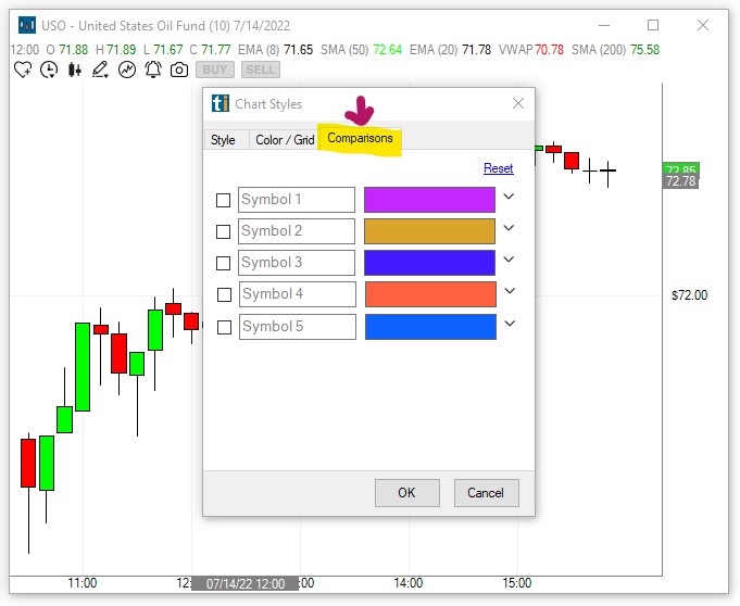
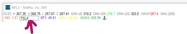
Enter stock symbols into the Symbol Fields 1 to 5, and add checkmarks to add the symbols to the chart.
The Reset Link will clear all entered symbols.
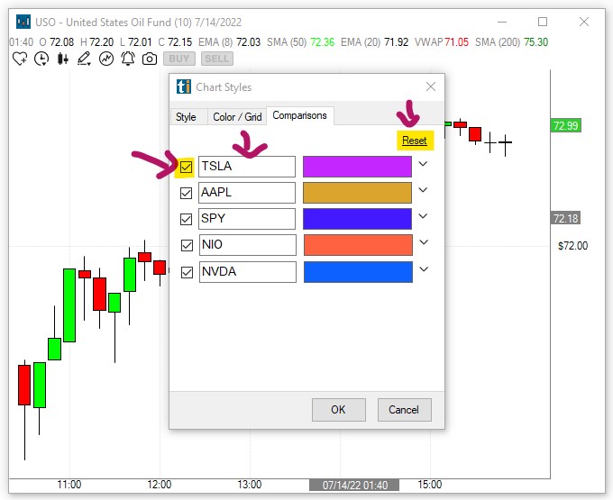
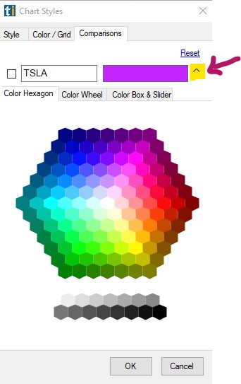
Clicking the small downward-pointing arrow on the right-hand side of the color field, will open the color picker window.
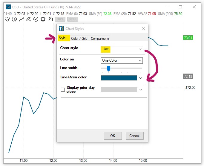
Since the 5 comparison symbols will be displayed as lines, it is advisable to change the style of the base chart to a Line Chart as well.
To do so, head to the Style Tab and select Line from the dropdown:
Press OK once you're ready to compare the stocks on your chart.
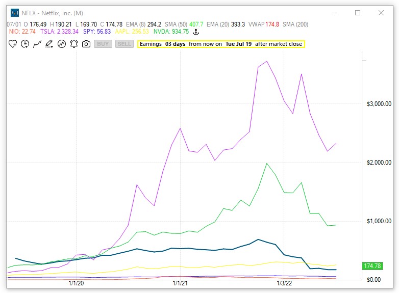
The Status Line at the top of your chart, will display the symbol of each stock in its given color. When hovering over the line of a stock on the chart, the price at that level will be displayed in the Status Line.
A simple click on a symbol in the Status Line, will bring up the Change Symbol Field, enabling you to easily enter a different symbol for comparison.
Press Enter to confirm the symbol change.
The Anker Icon enables you to Anker all compared stocks to a specific price level of the base stock.
To place an Anker, click the Anker Icon.
Next, move your cursor to the price level of the main chart symbol.
You will see that your cursor has turned into a small upward-pointing arrow.
Click into the chart to place the anker at a specific price level.
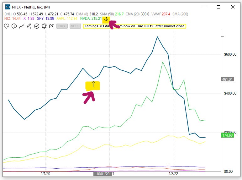
The date and time of the Anker level will be displayed in the Status Line. To remove the Anker, click the Bin Icon in the Status Line.